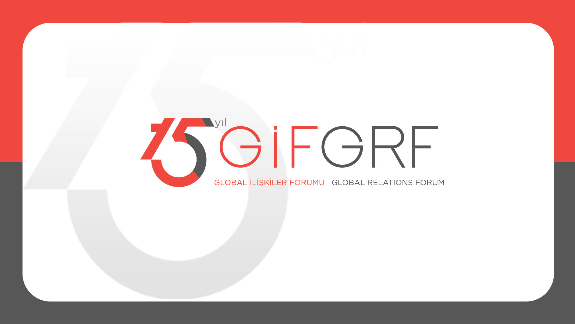
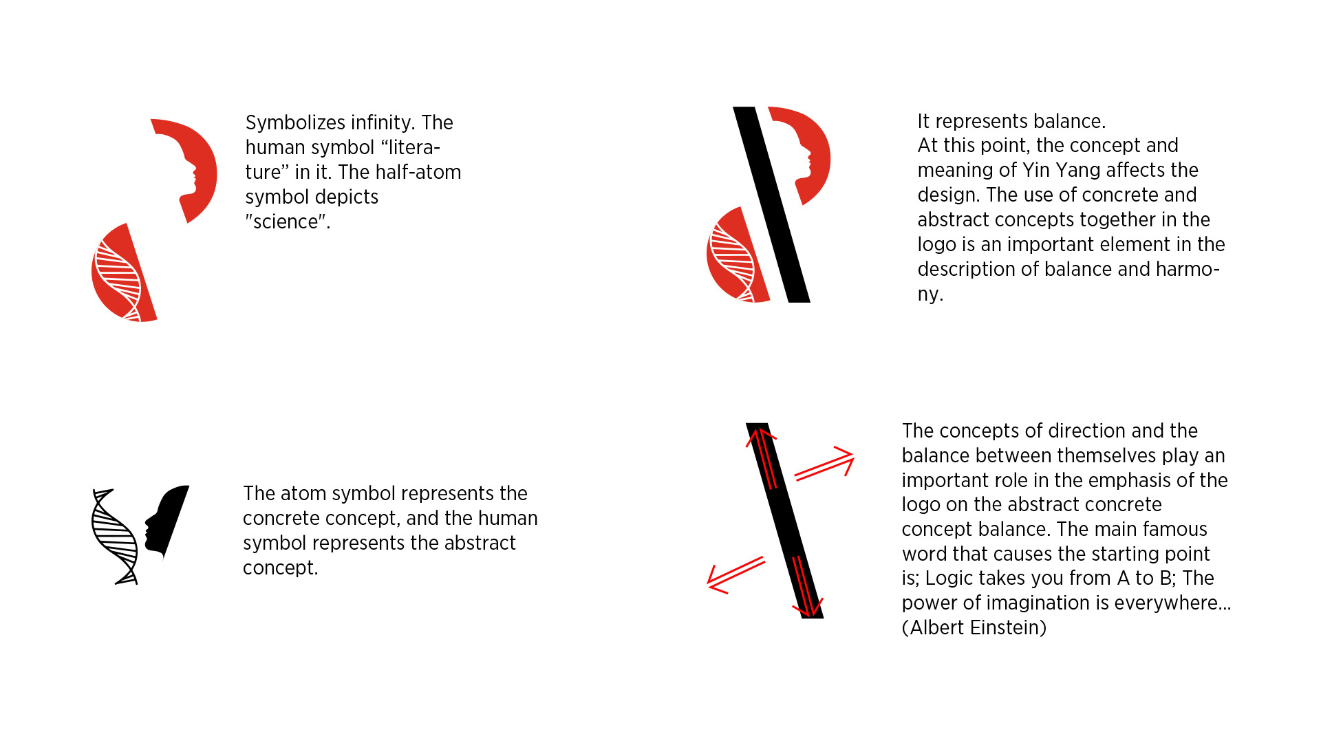
I was inspired by the Yin Yang concept, which depicts the iconic symbol of the Far East, especially in China. This concept shows that opposites are in balance and present within each other. It is a theory that dominates Asian geography, observing and explaining the relationship between the universe and nature. The basis of Yin Yang is the idea that everything in nature is in opposition and progresses through this opposition.
The concept of this logo reflects contrast and an integral balance. The element of equilibrium was created with reverse symmetry. According to these details:
Font groups in the corporate font family were preferred.
Gotham Narrow Black • Gotham Narrow Medium
Designer: Arzu Celik